
COVID TRENDS: MOBILITY IN AMERICA

I wrote this about a year ago as the public schools in Texas were transitioning from starting the year 100% virtual to in-person after Labor Day. As we head towards what will likely be an inevitable shut down of school districts in various parts of Texas as Delta variant cases continue to increase unabated, I thought this content was worth sharing once again.
Original post date: 11 September 2020/Friday/930pm CDT
"One set of messages of the society we live in is: Consume. Grow. Do what you want. Amuse yourselves. The very working of this economic system, which has bestowed these unprecedented liberties, most cherished in the form of physical mobility and material prosperity, depends on encouraging people to defy limits.”
-Susan Sontag, 2013, from her book “Illness as Metaphor and AIDS and its Metaphors"
High resolution version of today’s pandemic graphic: https://drive.google.com/file/d/1k7JY-f3J4LUrCg9WNAGHEvOd6dYbXnFW/view?usp=sharing
BACKGROUND
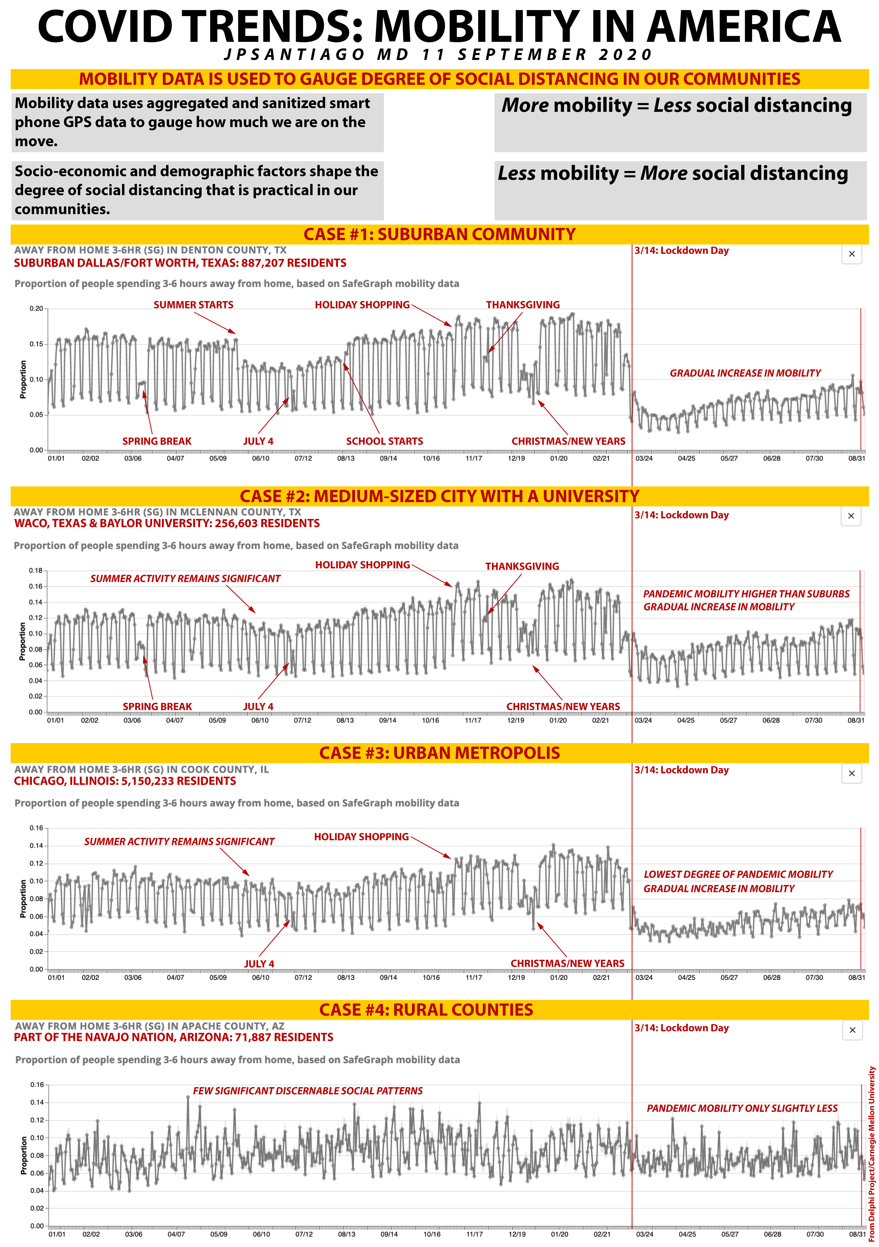
As in-person learning kicked off this past week in Texas, I thought it would be instructive too once again look at mobility data analysis. This is relatively new stuff when it comes to epidemiological modeling and has risen in value given the capabilities and ubiquity of smartphones in the general population.
The data here comes from SafeGraph, a mobility data provider used by many institutions in their epidemiological models- in the case of today’s discussion, the data is used by Carnegie Mellon University in their Delphi Project's COVIDcast updates at
https://covidcast.cmu.edu/
Several pandemic forecast models are using aggregate data from our smart phones to chart the mobility of a community. It’s an interesting take on the traditional epidemiological models that a total population is made up of susceptible people, infected people, and recovered people.
Now don’t worry, no one can determine if you were visiting that shady massage parlor in the red light district of your community. And rest assured that scientists couldn’t care where you buy your pet food. It’s a common practice to use aggregated data to determine mobility patterns- this is done not just in epidemiology, but in a whole host of other disciplines like urban planning.
Personally identifiable information is scrubbed out as it would be irrelevant and balloon the size of the data to an unmanageable size full of noise.
CASE STUDIES IN MOBILITY DATA
As I’ve been tracking pandemic data the last six months now (and have shockingly not gone insane- yet…….), I often look at mobility patterns to give context to the pandemic dynamics in any given community. For example, when a surge is taking place, I’m also looking at mobility data to see if the community is doing their part in trying to mitigate the impact of a surge- given that there is distaste at multiple governmental levels for the lockdowns and shelter in place orders like we had in April, mobility data has been useful to gauge the level of “buy in” by a community in doing their part i the absence of top down direction by local and state jurisdictions.
Over time I have noticed that mobility data at the county level shows patterns of social behavior but it also reflects socio-economic and demographic factors as well.
The pandemic experience of a household and the decisions they make regarding work and school are tied to median household incomes. Affluence provides options and choices. Don’t forget that. Just because it’s not a problem for you doesn’t mean it’s not a problem. That’s privilege. It has no place in my community.
In all four of the these data plots, we’re looking at mobility data away from home for three to six hours at a time- the dips in the data are usually weekends and the peaks are usually mid-week, Tuesday through Thursday.
In all four graphs, I have marked out with a red vertical line the Great Lockdown Day of March 14 when everything shut down.
CASE ONE: YOU CAN’T HIDE IN SUBURBIA
I’m going to pick on my home county again, Denton County, a suburban county of Dallas/Fort Worth with a population of 887,207 residents and the seventh most populous county in the state of Texas.
In this data plot, you can clearly see major events on the community calendar by changes in mobility patterns- Spring Break, the start of summer when school gets out, July 4th weekend, the start of school, the ramp up of holiday shopping, Thanksgiving and the holidays of Christmas and New Years. Even though Thanksgiving is traditionally the start of the holiday shopping season, just about every suburban county had that same uptick in mobility starting in the first week of November.
Post-lockdown, you can see that there’s a gradual increase in mobility in the last six months.
This is a typical mobility pattern I see in suburban counties. Other similar communities as examples:
Johnson County, Kansas (Kansas City, KS/MO)
Loudon County, Viriginia (Washington DC)
Arapahoe County, Colorado (Denver)
Orange County, California (Los Angeles)
CASE TWO: THOSE COLLEGE TOWNS
For this example, the data is for McLennan County, Texas- where the city of Waco is located and the campus for Baylor University. Now there are sizable university campuses in Denton County (University of North Texas) or even say Travis County (University of Texas at Austin), but those are in more populous counties. What I’m after in this group are counties with a single dominant medium sized city with a university campus.
In the mobility data, the big difference is that decreases in mobility during the summer aren’t as great as they are in the suburbs- this likely reflects ongoing campus activity through the summer- summer classes, camps, and so on.
In the post pandemic period, mobility in these counties with large university campuses is much higher than it is in the suburbs. Are college students not really changing their daily routines? The news reports we have been seeing about the reopening of colleges nationwide and rise in cases seem to indicate there’s an element in the college demographic that’s not really doing much social distancing at all.
For all intents and purposes, medium sized cities with universities are like the suburbs with more mobility (less social distancing).
This is a typical mobility pattern that I see in medium-sized cities with large university campuses. Other similar counties:
Payne County, Oklahoma (Stillwater and OSU)
Brazos County, Texas (Bryan-College Station and Texas A&M)
Washington County, Arkansas (Fayetteville and the University of Arkansas)
Douglas County, Kansas (Lawrence and the University of Kansas)
St. Joseph County, Indiana (South Bend and Notre Dame University)
CASE THREE: URBAN METROPOLIS, BUT NOT THE DARK FRITZ LANG ONE
For this example, I’m using the mobility data for Cook County, Illinois, where Chicago is located. Like university towns, summer mobility patterns remain fairly significant which is likely a function of the large numbers of residents in a variety of occupations in the service industries commensurate to a large urban environment.
Interestingly, urban counties have the lowest degree of post-lockdown mobility- I suspect this is a function of having more things closer to places of residence- while people in the suburbs might have a drive a few miles to the grocery store, a corner market might be just a block or two away in an urban location.
Like the suburbs and college towns, there is also a gradual increase in mobility over the last six months.
This is a typical mobility pattern for an urban metropolis. Other similar counties that have the same patterns of mobility:
Wayne County, Michigan (Detroit)
Kings County, New York (Brooklyn-NYC)
San Francisco County, California (San Francisco)
CASE FOUR: RURAL AMERICA
The rural counties have high fractions of poverty as well, and the data here is for Apache County, Arizona, which is in the eastern part of the Navajo Nation. Notice right away how markedly different the mobility patterns are for Apache County compared to the suburbs, a college town, and an urban metropolis.
If you want a graphic illustration of how rural America is a much different place than urban/suburban America, just look at the mobility data. Notice that there are few discernible social patterns, possibly Christmas/New Year being there.
Note also that there is little change in post-lockdown mobility as well- slightly less, but not by much and nowhere near anything resembling the post-lockdown mobility patterns in urban/suburban America.
This is a typical mobility pattern for a rural county- other examples include:
Texas County, Oklahoma
Tallahatchie County, Mississippi
Ritchie County, West Virgina
Oliver County, North Dakota
A lot of this may be due to the distances involved to schools, places of employment or grocery stores. Poverty is also a factor- census data indicates that poverty in rural areas is about 16 percent compared to 12 percent in urban areas. In the last 30 years in the United States, urban poverty has fallen faster than rural poverty- essentially widening the gap between rural and urban poverty rates.
Since records were tabulated by the US Census Bureau, rural poverty rates have always been higher than urban poverty rates. This pandemic has shown that counties with higher poverty rates are at high risk of COVID infection and death from COVID infection.
TAKE HOME MESSAGES
1/ Our nation is locked in a very counter-productive binary mode of thinking in this pandemic- lockdown versus no lockdown, remote versus in-person, vaccine versus not vaccine yet, Republican versus Democrat, liberal versus conservative, black versus white, rich versus poor, and so on and so on. The reality of this pandemic is that solutions are going to have to be much more nuanced and tailored to the communities affected. One size does not fit all and sadly that sort of approach requires a much more enlightened elected leadership than we have at the moment.
2/ The mobility data alone shows the diversity of communities and the challenges in each community when it comes to social distancing and any sort of lockdown or even partial lockdown. That’s not to say that I consider economic considerations on par with saving lives- every one of the soon to be 200,000 deaths in America from COVID are unnecessary deaths that diminish us as a nation. That’s a far more complex discussion than I have room and time for this evening, but I do think the economic realities of each community, whether it’s a suburb, a rural community, an urban core, or college town mean that a one size fits all approach to this pandemic is too simplistic.
2021 comment: We are now at 624,000 deaths. A year ago we were looking at 200,000 deaths and that was at the time, a soul-crushing number.
3/ I want to be absolutely clear that I am not letting the federal and state leaders off the hook by saying we need more nuanced and tailored approaches based on community characteristics. Some people like to repeat ad nauseaum “FEDERALISM!!!!” and dump this farrago of bovine scat on the states and local levels. There have to be some minimum standards set from the top. What we have is not federalism but cooperative federalism- where local, state, and federal officials interact cooperatively AND collectively to solve common problems instead of making competing and in many cases, conflicting policies in this pandemic.
PARTING THOUGHTS
Too tired. Not drunk enough. Maybe on my next post. For the time being, just stop being dicks to each other and we’ll work off that.
2021 comment: Apparently we’re worse dicks to each other now with the battle for mask mandates in schools.
FURTHER READING
MOBILITY DATA ANALYSIS AND COVID (03 July 2020): https://www.facebook.com/jp.j.santiago/posts/10216759612799625
COVID TRENDS: SELECT COLLEGE COUNTIES (17 August 2020): https://www.facebook.com/jp.j.santiago/posts/10217100590803862
DENTON COUNTY, TEXAS: COVID AND INCOME DISPARITY (03 August 2020): https://www.facebook.com/jp.j.santiago/posts/10216997434585021
THE FORTUITOUS TIMING OF SPRING BREAK IN TEXAS (30 April 2020): https://www.facebook.com/jp.j.santiago/posts/10216213267741340