
COVID TRENDS: TEXAS

“I feel like now there are sort of friends of SARS-CoV-2, people who are conspiracy theorists or vaccine denialists or claim personal freedoms that they really don't have or purveyors of misinformation. It's just hard to watch. I mean, this virus has a lot of friends out there who allow it to continue to spread and continue to do harm and, worse, continue to create possibly variants that are more and more resistant to vaccine-induced immunity.”
-Paul Offit MD, Director of the Vaccine Education Center at Children’s Hospital of Philadelphia, 29 July 2021
High resolution version of today's pandemic graphic:
https://drive.google.com/file/d/1ZMWXdnYJm7HE0JLmRO6gcz7ka3FgluvP/view?usp=sharing
BACKGROUND
We are seeing the start of the fourth wave of this pandemic fueled by a combination of a highly contagious and airborne variant, B.1.617.2 or Delta, loosened pandemic mitigation measures, and inconsistent vaccine uptake by the population. While we are not sure as of yet how bad this one will be in comparison with the waves of Spring 2020, Summer 2020 and Winter 2020-21, the indicators that this was coming were certainly visible as the medical and scientific community had been sounding the alarm for months prior.
Inconsistent messaging from public health authorities compounded matters amidst a politically charged atmosphere fueled by disinformation has further compounded our efforts.
The vast majority of those infected, hospitalized and dying of COVID are now the unvaccinated. There is tragedy in loss that could be prevented but there is worse tragedy in that those who are too young to be vaccinated are also paying the price for the petulance and capriciousness of those not willing to do their part. Pediatric hospitalizations are on the increase nationwide as well as increases in adult hospitalizations.
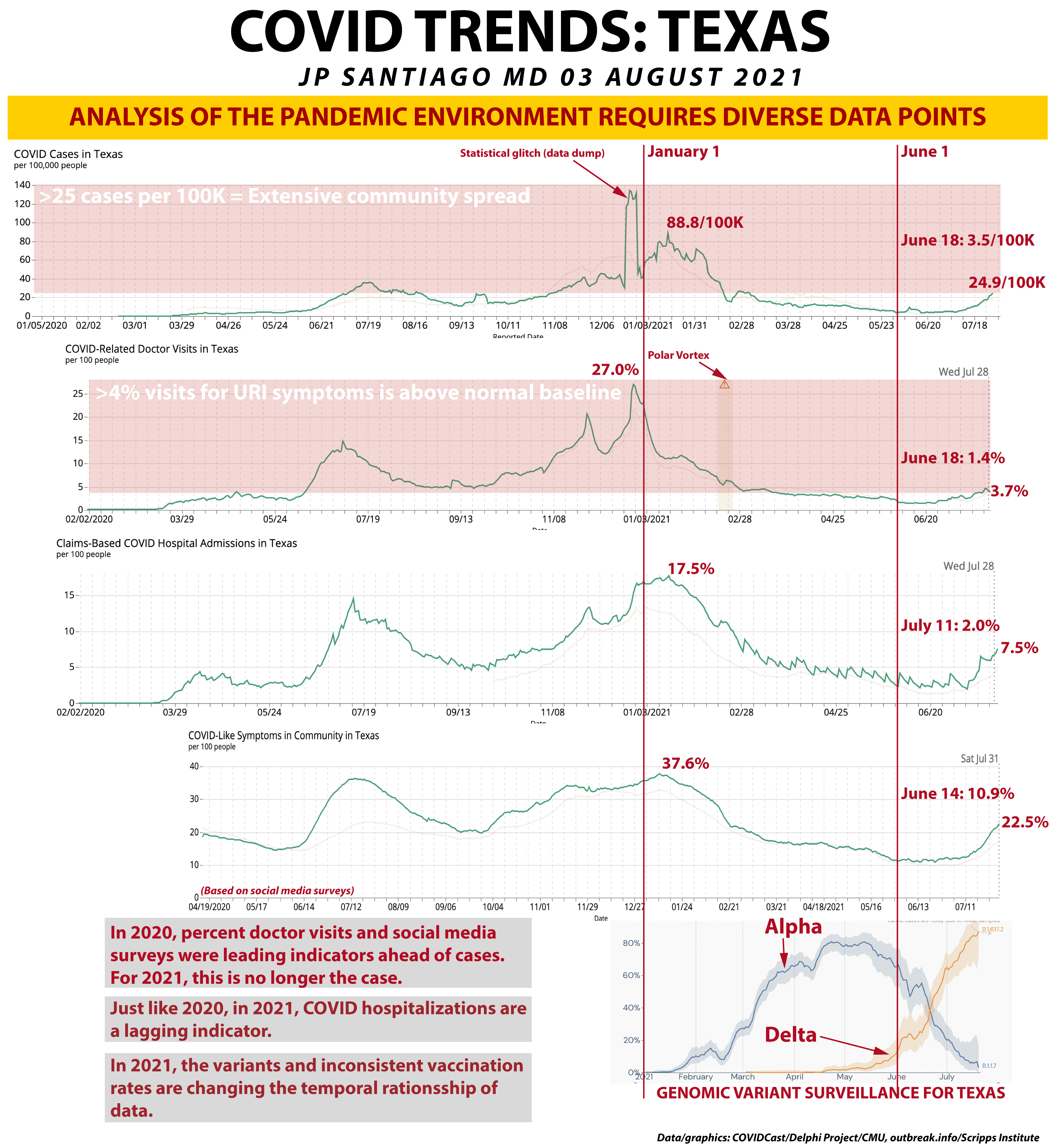
USING MULTIPLE DATA STREAMS TO ASSESS THE PANDEMIC ENVIRONMENT
What I have done in this graphic is taken five different data streams and "synced" their time frames up. The vertical red lines mark out January 1 and June 1. Why June 1? Partially it was arbitrary to keep from cluttering up the more recent data, but note that the nadirs of the first four graphs (the lowest or best part of each graph) fall after June 1.
The five data streams that I've tied together are COVID cases in Texas per 100,000 residents, percent doctor visits in Texas for COVID symptoms (which are upper respiratory tract infection symptoms, or URIs), claims-based COVID hospitalizations, social media surveys on COVID symptoms in the community, and finally genomic surveillance data comparing B.1.1.7 Alpha (the first variant) and B.1.617.2 Delta.
COVID CASES IN TEXAS PER 100,000 RESIDENTS
The UT Houston School of Public Health uses more than 25 cases per 100,000 residents as indicative of extensive community spread of COVID. I have marked out that area in light red. In Texas, our worst day was in the holiday surge with 88.8 cases/100K. Our best day in this pandemic was on June 18, only 3.5 cases/100K. We are currently at 24.9 cases per 100K and climbing.
Note the spike in December, that was a data dump that caused that little "glitch". I see that often in case data.
COVID-RELATED DOCTOR VISITS IN TEXAS
The second graph plots the percentage of outpatient doctor visits in Texas that are for COVID symptoms.
Let me be absolutely clear on this:
ANY UPPER RESPIRATORY TRACT SYMPTOM IS A COVID SYMPTOM UNTIL PROVEN OTHERWISE BY TESTING.
Runny nose, congestion, sore throat, cough, drainage, earaches, you name it. I've seen them as the presenting symptoms of COVID infection. This is the initial entry point of the SARS-CoV-2 virus into our bodies- via our upper airways.
Prior to the pandemic, approximately 3-4% of all outpatient physician visits were for upper respiratory tract symptoms, so I have marked out the area in light red that is greater than 4%. Note that the overall trends in this graph do follow what the first graph, cases per 100K, showed.
The February polar vortex in Texas affected doctor visits, so that area is marked out on the graph. Our worst day was right before New Years' with 27% of outpatient visits being for COVID symptoms. Our best day was on June 18 with only 1.4% of outpatient physician visits were for COVID symptoms. We are now at 3.7% and climbing.
I would have expected this number higher, but keep in mind that doctor visits is a form of syndromic surveillance. We're looking for actual sick people. Before January, we didn't have vaccinations. Now we do and those infected and vaccinated are likely asymptomatic or with very mild illness. Last summer we had a surge as well but no vaccinations.
CLAIMS-BASED COVID HOSPITALIZATIONS IN TEXAS
The third graph plots COVID hospitalizations in Texas based on insurance claims data. Again, note that the overall trends and surges match the previous two graphs. At our worst day in January, 17.5% of hospital admissions were for COVID. That surge lasted for a while as it started in late October. We went several weeks in the DFW area with available ICU beds tallied in *single* digits.
The best day in Texas for the pandemic in terms of hospitalizations was July 11 with only 2% of admissions being for COVID. We are currently at 7.5% and climbing. Several other states have already passed their previous high-water marks set during the winter surge (like Florida).
COVID-LIKE SYMPTOMS IN THE COMMUNITY
This is a fascinating parameter to track. It's based on the Delphi Project's social media surveys- they get thousands of survey responses daily from Facebook users that have been a really useful measure of the pandemic environment. Notice that it also follows the previous three graphs in terms of overall trends and shape. As it is a data that is not dependent at all on testing and is also a form of syndromic surveillance (its assessing the prevalence of those actually sick), it's considered durable data.
The worst time came in January when 37.6% of surveyed FB users in Texas reported knowing at least one person with COVID symptoms. That was nearly matched by the previous summer in July. The best point was June 14 with only 10.9% of users reporting knowing someone with COVID symptoms. We are now at 22.5% and climbing as well.
Interestingly this parameter accounts for more potential cases than actual cases. We've never really determined the true numbers of those infected in this pandemic. Serology based prevalence studies suggest far more were infected but the numbers vary and the antibody assays have their own limitations.
GENOMIC SURVEILLANCE IN TEXAS
This prevalence data comes from outbreak.info which is a consortium of research institutions led by Scripps Research Institute. What I've done is plotted the prevalence of B.1.1.7 (Alpha variant) and B.1.617.2 (Delta variant) in Texas.
Note that mid-June is where Delta overtook Alpha as the dominant strain in Texas and that also coincides when the things that were getting better reversed course in the previous four graphs.
Note also that this demonstrates the marked difference in Delta's behavior over the Alpha variant. When Alpha was surging in Texas, overall pandemic parameters were still improving, likely as a result of mask mandates still in place, vaccination numbers were increasing, and the Alpha variant does not have the immune escape mutations of Delta as well as it was not as contagious as Delta.
DECOUPLING OF PARAMETERS
Note that before January, percent doctor visits and social media surveys tended to lead cases and cases led hospitalizations. Before January this is what we could almost count on like clockwork:
T0: Change in public behavior (like start of school or a big gathering)
T+1 week: Change in Google search data trends
T+1 week: Change in percent doctor visits for COVID symptoms
T+1-2 weeks: Change in social media survey reporting
T+2 weeks: Change new daily cases
T+2 weeks: Change in test positive rates
T+2-4 weeks: Change in hospitalizations
T+4-6 weeks: Change in death rates
Since January, I have noticed that the parameters are losing their temporal relationships or "decoupling". There are a number of reasons for this- the two biggest ones are the presence of more contagious variants and the arrival of the vaccines. There is also the widespread availability of COVID rapid testing in the outpatient setting, something that was tough to come by last year. The expansion of rapid testing narrowed the gap between doctor visits and case numbers. We have also improved our treatment modalities for hospitalized patients, so mortality rates have improved but there is still much work in this area to do.
For 2021, hospitalizations are still a lagging indicator and still more than I'd expect given the availability of monoclonal antibody treatments (and vaccines, but that goes without saying).
TAKE HOME MESSAGES
1/ Multiple forms of data in aggregate can provide a good indication of the state of the local pandemic environment. Looking at a single parameter has its pitfalls. Seeing diverse data streams agree with each other lends reliability to the data for decision making.
2/ The combination of percent doctor visits for COVID symptoms and social media survey reporting may be a more reliable indicator of pandemic burden in the community than case numbers, particularly when testing is not extensive and test positive rates are over 10%, indicating that testing is not enough to pick up all cases and test their close contacts.
3/ Hospitalizations for COVID continue to be a lagging indicator, usually about 3-4 weeks after changes in percent doctor visits, social media surveys and case numbers. What we are seeing in hospitalizations now is a reflection of what the pandemic environment was 3-4 weeks ago.
4/ MAJOR POINT! Hospitalizations now tell you what the pandemic was doing 3-4 weeks ago.
5/ What we did in terms of vaccination uptake, mask mandates, and other mitigation measures did much to blunt the impact of B.1.1.7 Alpha across the United States even though there were more regional/localized surges like Michigan in February/March. Alpha is less contagious and did not possess mutations to dampen our immune system response.
6/ Now we have declining vaccination rates, no mask mandates, less mitigation with a dominant variant that is highly contagious and airborne. The data has long been predictive on where this story ends.
PARTING THOUGHTS
I can't believe that one year after last summer 's surge were literally in the same boat again only this time we actually have the tools and methods not have this happen again yet a significant part of this nation is more than happy to score an own-goal and then celebrate it as an expression of freedom.
That's incredibly frustrating and fatiguing to be where we are now when this was entirely predictable and preventable.
I fear the worst is yet to come as schools haven't started yet. And Delta negates many of the natural advantages children had last year.
This is not last year's pandemic by a long shot.
PAST PANDEMIC POSTS
NEW VARIANT OF CONCERN: AY.3 (DELTA SUBVARIANT) (22 July 2021): https://www.facebook.com/jp.j.santiago/posts/10219219371852064
HE SAID WHAT? A WARNING FOR THE UNITED STATES (12 July 2021): https://www.facebook.com/1141591254/posts/10219175207947994
WHERE IS THE DELTA VARIANT SURGING? (11 July 2021): https://www.facebook.com/1141591254/posts/10219170740476310
COVID VARIANTS TABLE UPDATE (30 June 2021): https://www.facebook.com/jp.j.santiago/posts/10219119070944604
MAYO CLINIC GRAND ROUNDS: VACCINES AND VARIANTS (14 June 2021): https://www.facebook.com/jp.j.santiago/posts/10219031846404045
THE MOLECULAR BIOLOGY OF THE E484K MUTATION (10 May 2021): https://www.facebook.com/jp.j.santiago/posts/10218832046529173
IMMUNOLOGY 101: THE IMMUNE SYSTEM- REPOST/UPDATE (05 May 2021): https://www.facebook.com/jp.j.santiago/posts/10218801066954703
COVID VARIANTS OVERVIEW AND UPDATE (22 April 2021): https://www.facebook.com/jp.j.santiago/posts/10218722676514991
NEW COVID VARIANT OF INTEREST: B.1.617 (18 April 2021): https://www.facebook.com/jp.j.santiago/posts/10218699298170547
CASE SURGES CAN RESULT IN COVID VARIANTS (12 April 2021): https://www.facebook.com/jp.j.santiago/posts/10218657527966318
THE OVERVIEW & STATUS OF COVID VARIANTS (9 April 2021): https://www.facebook.com/jp.j.santiago/posts/10218637120816152
QUICK UPDATE: THE COVID FAMILY TREE (01 February 2021): https://www.facebook.com/jp.j.santiago/posts/10218211054244754
COVID MUTANTS: VARIANTS OF CONCERN (31 January 2021): https://www.facebook.com/jp.j.santiago/posts/10218204381877949
COVID MOLECULAR BIOLOGY: THE SPIKE (6 January 2021): https://www.facebook.com/jp.j.santiago/posts/10218019683340601